Polly is CLARK UK’s dedicated life insurance brand for women — created to make financial protection more accessible, less intimidating, and genuinely useful for a new generation of customers. In 2025, it was time for Polly to evolve.
We set out to reimagine the brand from the ground up: visually, emotionally, and strategically. The result is a bold new digital presence — vibrant, expressive, and unapologetically modern.
Creative Direction
The rebrand centered around three core goals:
- Break away from the expected (and often outdated) visual codes of the insurance industry
- Bring energy, warmth, and optimism into the user experience
- Visually reflect the complexity and richness of women’s lives today
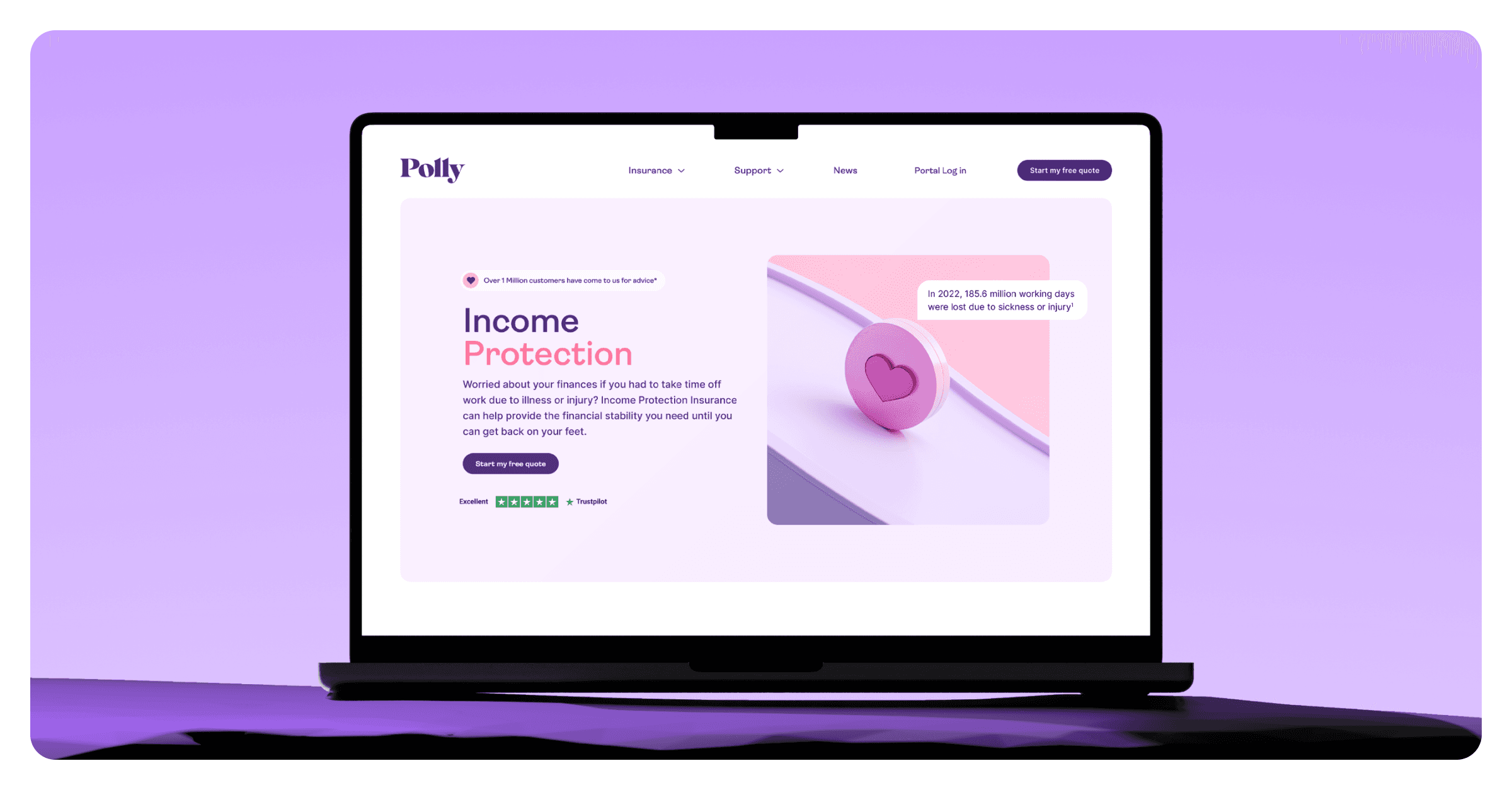
We introduced a refreshed colour palette — one that’s uplifting, playful, and full of momentum. It’s a dramatic shift from the softer pastels of the previous identity, and it instantly gives Polly a bolder, more confident personality.
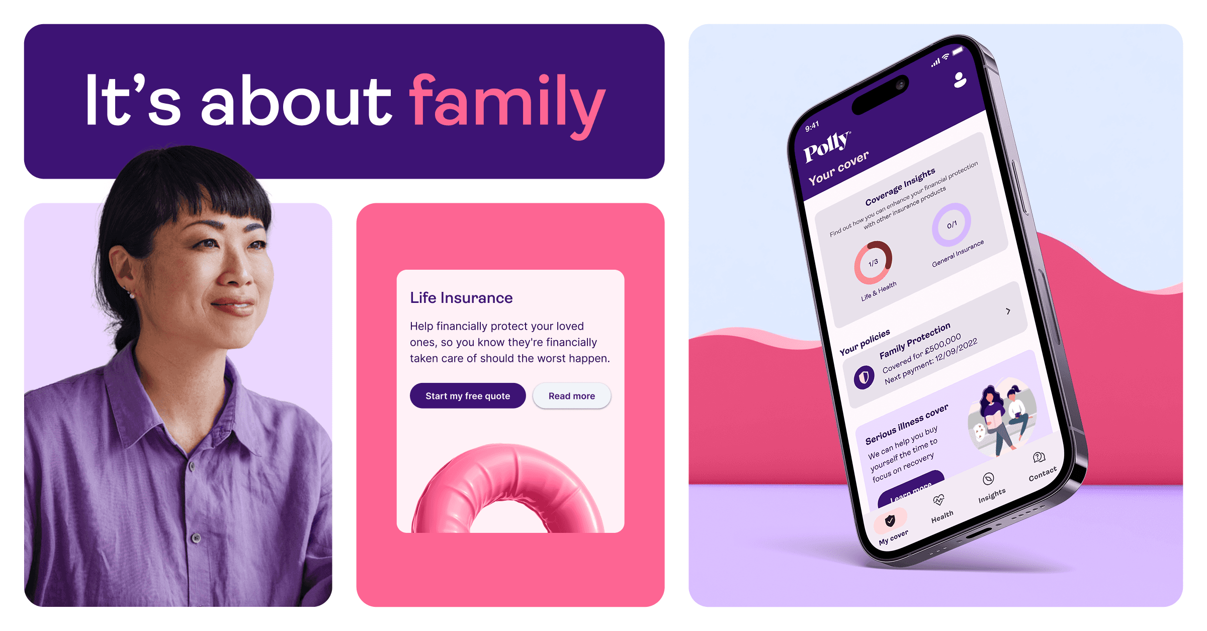
To add depth and a forward-looking edge, our design team created a library of abstract, soft-edged 3D objects using Midjourney. These forms bring texture, movement, and a subtle tech aesthetic to the site — supporting our vision of Polly as a digital-first, emotionally intelligent brand.
We also rolled out a new photographic direction that feels strong and empowering, capturing women at different stages of life — navigating careers, buying homes, starting families, and more. The imagery avoids tired stereotypes and instead reflects real ambition, resilience, and modernity.
Collaboration & Execution
This project was brought to life in just under two months — a fast-paced collaboration between brand, design, product, and development teams. As Head of Brand, I led the overall creative vision and direction, aligning the brand strategy with our visual and verbal evolution.
Huge credit goes to the incredible female-led brand team at CLARK, including Luca Steiler and Paulina Lukarska, for their creative drive and eye for detail throughout.
Outcome
The new Polly website doesn’t just look different — it feels different. It tells a clearer, bolder story. It invites users in with confidence and clarity. And most importantly, it’s designed to move with the women it’s built for.